Operation: Fragile Cactus
A rabbit conjuring a magician from a top hat. A cactus packed in bubblewrap. A cowboy astride a bucking yo-yo.
While it all might sound like a fever dream from another dimension, it’s not. It’s just a small sampling of what Taylor Ungureanu, our graphic designer, delivered when we asked her to reimagine our favorite deck of archetype cards.
The original deck, which we’ve used for over a decade to guide client workshops, is called Archetypes in Branding (available here). Created by Margaret Pott Hartwell and Joshua C. Chen, we’ve found these 60 cards bring needed nuance to the 12 archetypes traditionally used in branding.
What are archetypes?
If you already know about archetypes in branding, feel free to skip ahead a bit. But if it’s a new concept, here’s the rundown.
Archetypes are rooted in the writings of Plato. He believed that everything we see in the real world is an imperfect expression of a perfect form. For Plato, every horse you’ve ever seen was merely a poor, slipshod version of pure, ideal horse. Every tomato, a dim reflection of absolute tomato. (Sounds like a rather disappointing way to see the world, if you ask us.)
A few thousand years later, Carl Jung put his own spin on archetypes. As a psychologist, he noticed patterns in what his patients discussed. Many dreamed of the same symbols and character types—and Jung began to suspect that these patterns were not learned, but innate to human psychology. He described archetypes like the wise old man, the shadow, and the mother.
Other thinkers followed suit. Maybe you’ve heard of the famous book by Joseph Campbell, The Hero With a Thousand Faces? The title describes archetypes in a nutshell: an image or pattern of belief seen across centuries and cultures. The names and faces may change, but what culture doesn’t have the story of a hero who overcomes great obstacles and sacrifices themself for the good of the community?
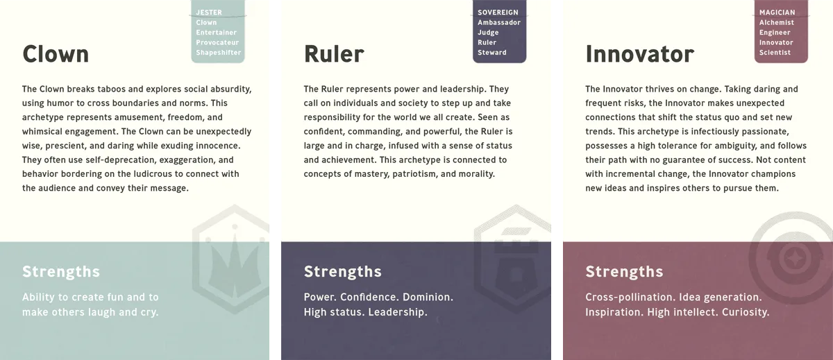
Archetypes eventually made their way into branding. The 2001 publication of The Hero and the Outlaw argued that brands could (and should) align themselves with these innate psychological patterns. In the book, Carol Pearson and Margaret Mark outlined 12 brand archetypes.
How Archetypes Affect Brand Identity
Brand archetypes soon became immensely popular.
Agencies would eagerly assign new clients an archetype. “Congratulations, you are now the Innocent.”
Our founders worked at agencies that took this approach. For them, it didn’t sit well for two reasons.
First, it’s prescriptive. Second, only having 12 archetypes to choose from is quite limiting.
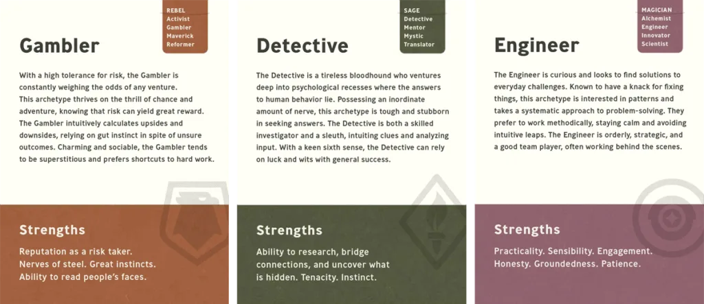
After starting Infantree, they came across Archetypes in Branding. The deck of cards provides four variations of each of the original 12 archetypes, for a total of 60.
Infantree began using these archetype cards to lead clients through archetype workshops. Rather than assigning them the archetype we thought was right, we’d invite their team to sit around a table, read through the different archetypes, and evaluate them together. Often, this led to interesting, unexpected pairings. The Visionary Citizen. The Warrior Alchemist. The Angel Muse.
It also lets clients lead the process, resulting in a sense of ownership and excitement around their archetypes.
“I’ve been fascinated by how attached some clients have become to their archetype,” says Ryan Martin, cofounder of Infantree. “We have loved watching an executive team or a group of founders wrestle through the cards, challenging each other’s responses and highlighting areas where they have been at their best as an organization.”
Making a Favorite Workshop Tool More Accessible
If we love these cards so much, why did we go and change them?
- We wanted to simplify. The language on the original cards was a bit academic, and some clients had a hard time connecting with it.
- We wanted more approachable names. While most of the archetype names were great, there were a few that consistently made people feel uncomfortable. For example, the Patriarch—which we shifted to the Steward. We hope this will help clients see past the archetype’s name and understand what it’s really about.
- Bigger text. Because sometimes, clients forget their glasses.
- A cohesive, Infantree feel. We wanted to redesign the cards from a visual perspective to match our own brand.
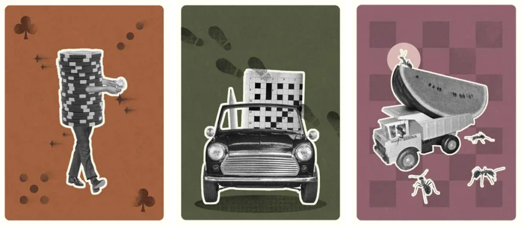
While most of these changes were relatively minor, the visual redesign, led by Taylor, was a bigger lift.
“I wanted to find an interesting way to portray what each archetype card was saying, without being literal,” she says. “I wanted to bring things together in a way you wouldn’t normally think of, and have it make sense in an interesting way.”
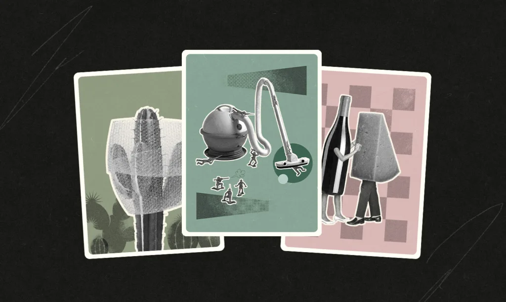
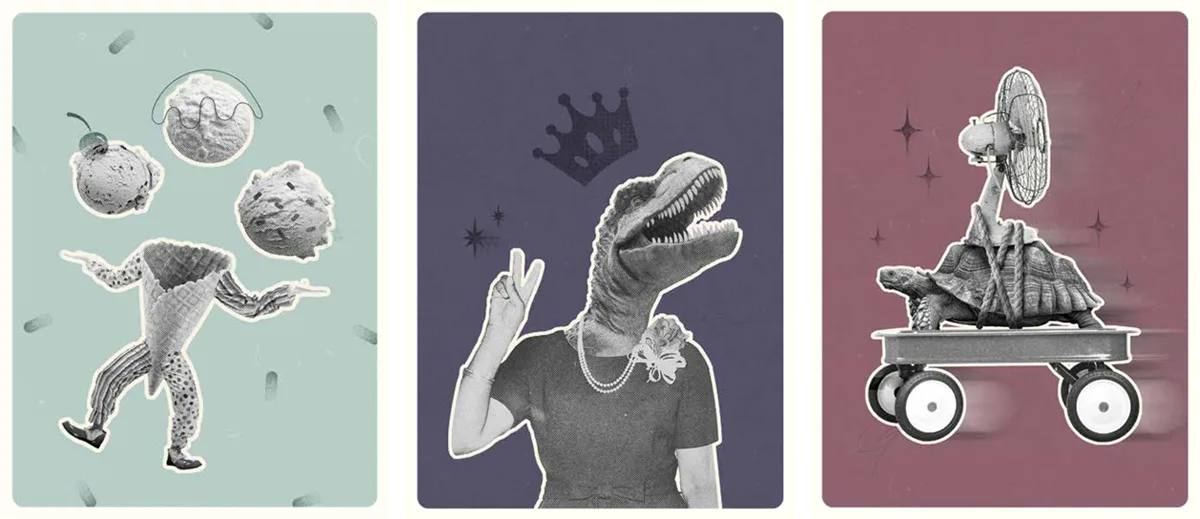
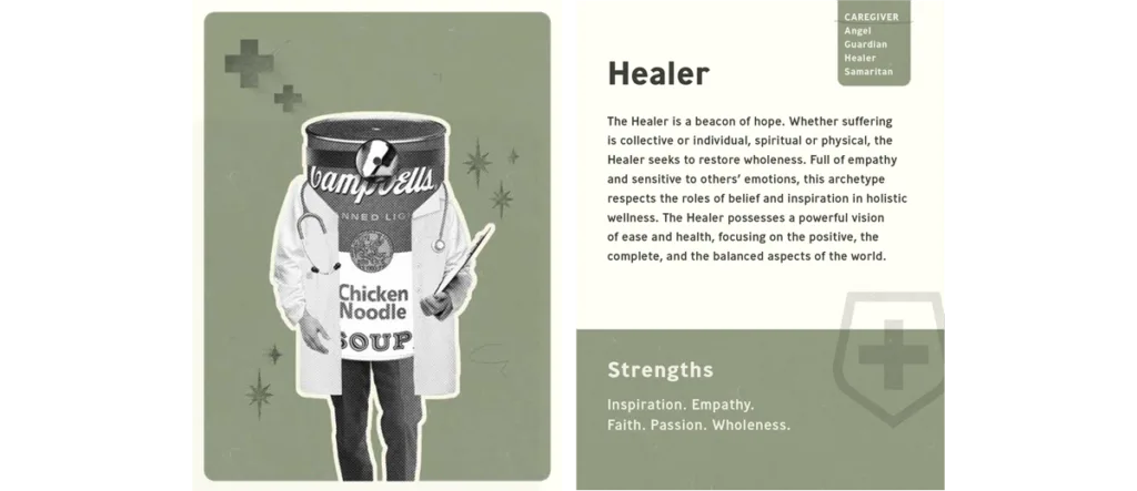
Did she ever. Drawing inspiration from old print collages, ephemera, Wes Anderson films, and a vintage color palette, Taylor created zany new illustrations for each of the 60 archetypes.
Her personal favorites? The Warrior, featuring a platoon of plastic army guys fighting a retro Hoover, and the Romantic, which shows a waltzing bottle of wine and wedge of cheese.
If you’d like to buy your own copy of our revised archetype cards, you can’t. They’re not for sale. While we’ve made some tweaks based on our personal experiences using these cards for more than a decade, the original cards are still FANTASTIC, and we encourage you to grab a copy from the team that created them.
Speaking of the creators, we owe them a great deal of thanks. Not only for giving us the green light to take what you created and put our own twist on it, but for creating it in the first place. Margaret and Joshua, you’ve given us an invaluable tool for understanding the brands we work with. And you’ve helped so many of our clients express their motivations, dreams, and values with a clarity they’d never been able to find before.