Identity Noun
The fact of being who or what a person or thing is.
— Oxford Dictionary
As its definition suggests, ‘identity’ gets to the heart of what a person or organization represents. When brands seek to set a visual identity, they are attempting to encapsulate that idea of who or what they are through how they look. A brand’s entire identity system needs to communicate the core of who they are to anyone who is interacting with it.
Is the brand cutting-edge and sleek? Then steer clear of the Papyrus typeface. Is it playful and approachable? Then, by all means, use trendy bright colors. Irreverent and unexpected? Use that picture of a grandma popping a wheelie.

That’s why it’s important to take a good deal of time and effort in understanding the core of your brand personality. It’s from this foundation that visual identity can be built. Once you know who you are, visuals can be created that work hard to clue others into that truth. And one of the primary elements is the logo.
A Visual Clue
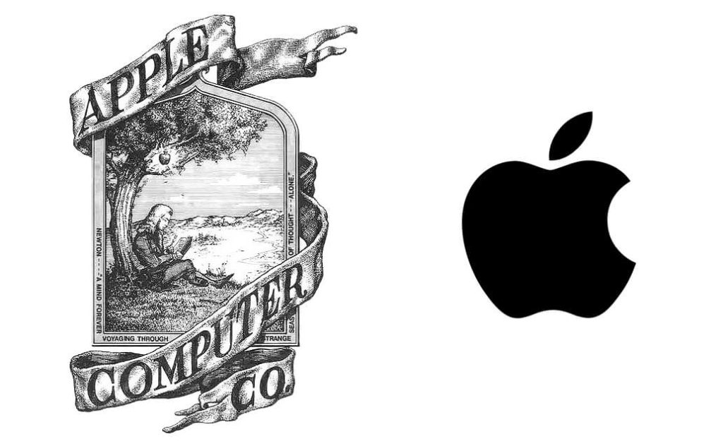
The logo mark is the first indicator of what people expect from a brand. Take, for instance, a brand that seems to be the epitome of design inspiration: Apple. They’ve spent years creating a visual brand that is highly recognizable and shows people they’re looking towards the future. The funny thing is, if you’ve ever seen their original logo created in 1976, it communicated a different idea. The mark elicited a sense of heritage and establishment that I’d expect to find pasted inside an old player piano. They could claim to be cutting edge and modern all they want, but if they had kept their original logo they would have had a hard time convincing people that to be true.

So how do we make sure the visual identity matches the brand? It’s a process of gathering, concepting, and implementing. These steps ensure the logos we create become a carrier for meaning, communicating the heart of the brand.
Gather Inspiration
Once we’ve spent time understanding the brand, we can set a visual direction we want to explore. We often create what we call a visual language—a collage of colors, type references, illustration styles, textures, and photography to give us a sandbox to work within. These images should visually reflect the personality that’s been defined for the brand.
Once this collage is in place, we use it as inspiration to guide our exploration of concepts. It helps us decide whether type should be bold or light. Whether colors should be bright or muted. Whether icons should be complex or simple. Having this guide in place keeps us from exploring concepts that wouldn’t serve the brand well.

Build Concepts
One of the most grueling, yet exhilarating, parts of the process is when we put pen to paper and begin creating. This step allows us to explore. Oftentimes, as we’re sketching ideas, we’ll see things on paper that either prompt new directions or solidify an idea we hoped would work. This exploration doesn’t stop once we bring things onto the computer. We’re constantly taking ideas and tweaking and reworking them on-screen to make sure they’re communicating the way we want them to. Throughout this process, critique is essential to make sure we stay on the mark.
Here are a few questions we ask ourselves:

1. Is this mark unique?
Can the brand own this mark? Can it be unlike anything else in their industry? When we worked with Atomic—an event and experience production company—this was on our minds. Building off the outer space connotation of their name, we created a mark that incorporated a spaceship circling the letter “O” in their name like a planet, which has now become an iconic indicator for the company.

2. Is this mark versatile?
Can it be used at different sizes, in limited colors, and on various applications? Creating a logo that looks good on a static white background takes effort. But it takes even more effort to make sure the logo will still be recognizable when placed in the corner of an ad, or in one color on a pen, or small in the header of the website. This is one of the biggest critiques we have when clients come to us for a rebrand. This was something we faced when working with Lancaster County Christian School. Their old mark used a lot of gradients that made it hard to use in one-color applications. We kept the concept of their mark the same but drastically overhauled it to create a new logo that was able to scale and change color without complications.

3. Is this mark readable?
Can the user clearly understand how to read the mark? This doesn’t mean that every aspect of the mark has to be a straight font. We use unique icons and combinations of letterforms to make sure the mark is unique, but we also need to balance those unique aspects with readability. There shouldn’t be any doubt as to what the brand’s name is. When we created a logo for our SEO partners at Evident, we came up with a wordmark with highly abstracted letterforms. Even though most of the letters were missing sections, we were able to maintain readability by keeping the most important parts of the letters.

4. Is this mark representative?
Does this mark quickly clue others into the personality of the brand and invite them into a deeper exploration of the brand? Logos don’t always need to show exactly what’s being sold or offered to draw people in. Take LUCA, a renowned wood-burning Italian restaurant in our hometown. A love for the “old country” of Italy was their inspiration from the start, and that was infused into every detail of their brand. There wasn’t a need to put wood-fired pizzas or Italian countrysides on the logo. We could evoke that feeling of Italy by taking cues from classic Italian designs, creating a logo that sets the stage for the Italian-inspired dinner their customers can expect to enjoy.
Implement Identity Systems
As we’re working through concepting logos, we’re always thinking about how they’ll be used, knowing that they won’t live inside a vacuum. They’ll be used within a larger brand identity system of colors, fonts, photos, patterns, illustrations, and more to create a unified identity that works together to communicate the personality of the brand. Knowing this takes some of the pressure off the logo because it doesn’t have to do ALL the heavy lifting.
It’s the complete identity system that truly lets the brand shine.
But, Logos Really Do Matter
While the visual identity is definitely more than the logo, never underestimate the power the logo has to build association and communicate your identity. These marks become beloved symbols over time through consistent exposure. It doesn’t happen overnight, but with diligence and perseverance, logos have the ability to capture people in a way that goes beyond identity.
It takes effort, understanding, and a little intuition to craft a mark that wields that kind of power. But, in the end, it’s worth it to create such a powerful symbol that is impressed into the hearts and minds of those who interact with it.
